 +
+
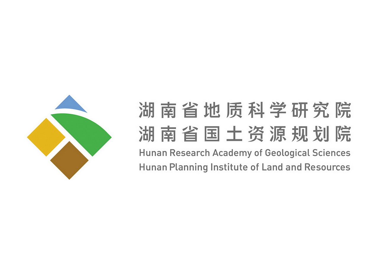
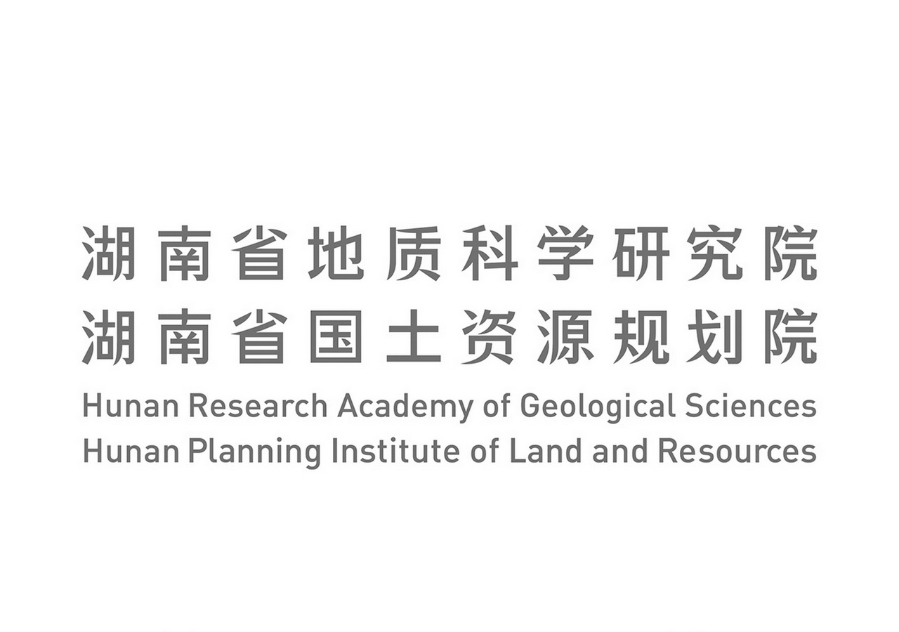
湖南省地质科学研究院
-
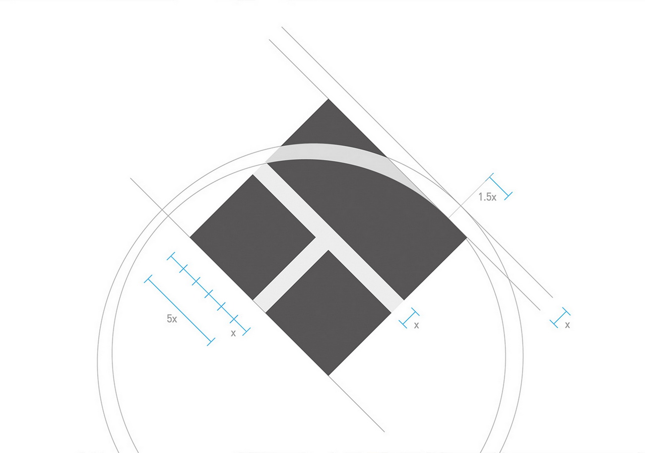
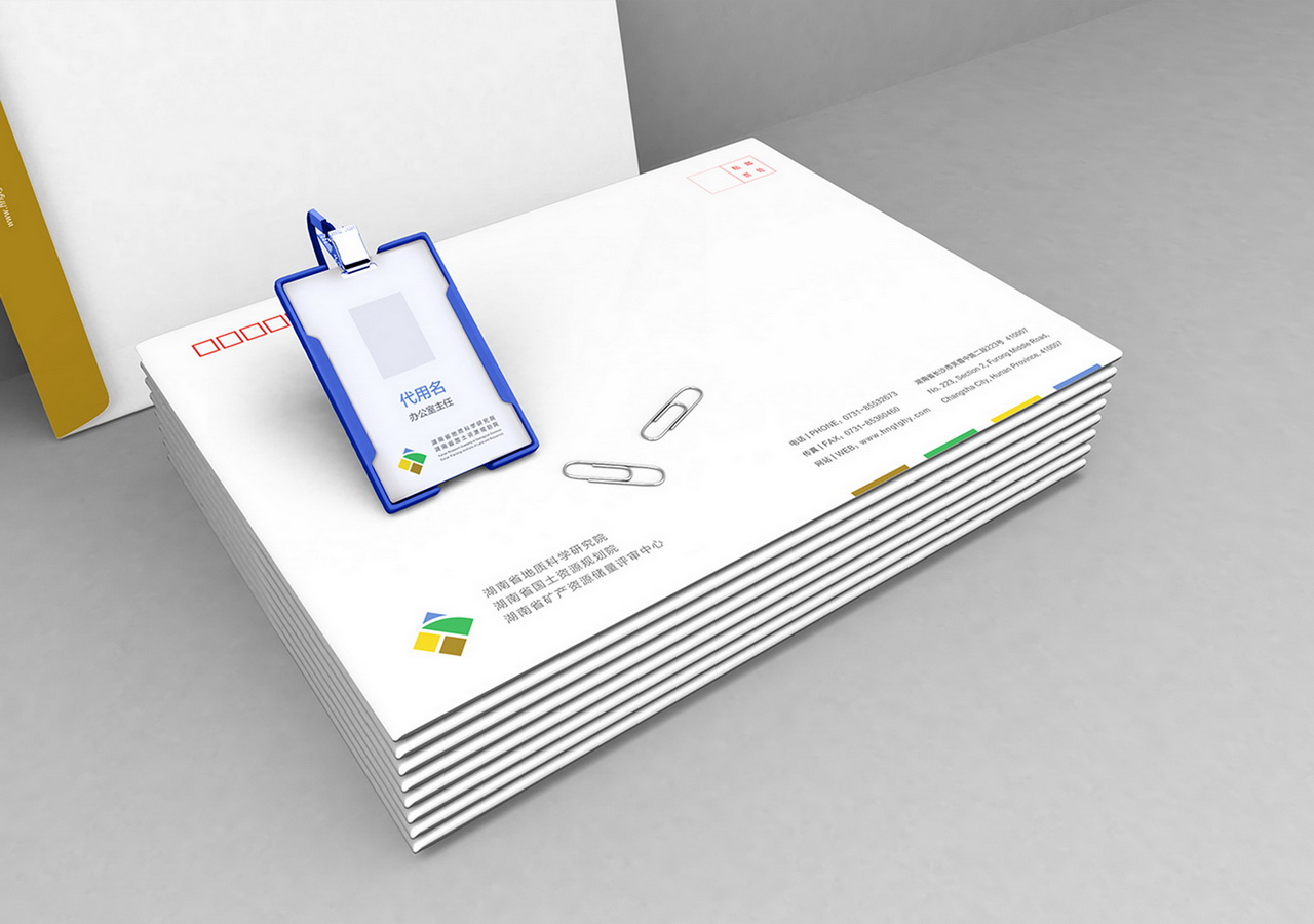
为湖南地质科学研究院定制的全新标志及视觉识别体系。我们的任务是通过标志反映地质和规划的行业特征。我们将代表湖南的字母HN隐藏在标志的负形之中,这样,标志的上半部分就演化为山峰与河流,下半部分则形似岩层的地质剖面。我们利用标志里被分割出的图形塑造了独特的中文字体用作企业名称。标志色彩来源于大自然中的独特地貌,通过这四个基本色块,我们为客户设计了整套办公用品。
Branding for Hunan Research Academy of Geological Sciences. Our brief was to create a brand new logo that reflects the geology and planning features. We placed letters HN representing Hunan Province hiding in the negative shape. So the upper half of the logo turned to be mountain and river, the lower half seemed to be rock cross-section. With the segmented graphics of the logo we built a set of unique Chinese characters for the name. Colors were taken from the unique landform of nature. With the four color block, we designed the whole stationery for our client.
项 目:品牌
客 户:湖南省国土资源规划院
设 计:Dooo Design Studio
时 间:13-09-01
荣 誉
------------------------------
奖 项:Hiiibrand 2013 国际品牌标志设计大赛 - 入选
出 版:《品牌设计零距离》 - 刊载